Friday, August 21, 2015

Carmen Left Me Confused

Carmen, written by George Bizet and directed by Eugene Tzigane, attempted to stage the 1875 opera in an updated and relatable way by modernizing the performance. In this attempt, however, the opera fell sorely short: poor costume design and choreography combined to make the performance severely underwhelming.

Perhaps the most confusing—and ultimately most disappointing—part of the production was the costume design. It seemed as if the costume designer, Zana Bosnjak, was trying to modernize the production through the costumes, but any sense of time or place was completely lost: some of the costumes were very obviously 1950’s mockups, some were modern day fashions, others were 1920’s flapper dresses, etc. It wasn’t only that the costumes had no cohesion with one another—the costumes also didn’t even seem to make sense internally. For example, one character wore a 1950’s ensemble, complete with a waist-high A-line skirt and a cap sleeve top, which was for some reason paired with 2000’s-era rope soled espadrille wedges.

The exaggerated platinum blond wigs worn by Frasquita and Mercedes—closely resembling what one would find in the dressing room of a mid-grade strip club—were also extremely confusing, but perhaps not as confusing as the decision to put a chorus singer in the Midwestern meth-addict uniform of cutoff jean shorts with an ill-fitting baby doll tank top and athletic slides. Yes, athletic slides. Carmen herself was heavy-handedly costumed in a 55-year-old librarian’s idea of what a badass young woman would wear these days—her halter dress, leather jacket, low-slung belt and leggings felt less like the wardrobe of an exacting temptress and more like what Dog the Bounty Hunter’s wife would wear on date night. The costumes seemed to be the prime attempt to modernize the opera, but a glaring lack of any aesthetic sensibility or direction left the audience terribly confused and visually offended.

The performance also fell short in its choreography. The beginning of the opera had many promising moments, like one scene in which drunken Frasquita and Mercedes combined small repetitive movements into an understated symphony of movement. However, the biggest and most important choreographic moments were not so understated or so successful. The final scene, in which Don José stabs Carmen to death, was painfully disappointing. This scene is the culmination of all of the opera’s drama—Don José is so unstable and wounded so as to brutally murder the woman he loves—and should be riveting. This, however, was made completely impossible by the fact that this most important and dramatic climax of the performance was performed with both Carmen’s and Don José’s backs to the audience. This decision felt like a lazy way to bypass the technical difficulty of performing a stabbing scene onstage, and was then followed up by Carmen performing a drawn-out choreographed stumble until she ultimately and unconvincingly fell down. It was quite an unsatisfying end to the performance.


Carmen is not a show I would recommend. Though the music was excellent—Don José’s confession of love was extremely powerful and beautiful—the disjointed costuming and poorly-choreographed ending left me more confused than pleased.

Achieving Surrealism: Dubuffet’s Carnation sanguine (1950)

Freddy Avis
20 August 2015
Achieving Surrealism: Dubuffet’s Carnation sanguine (1950)
            In the corner of Stockholm’s Moderna Museet’s surrealist exhibit sits Jean Dubuffet’s Carnation sanguine, a portrait of an amorphous alien-looking figure decorated with a child-like facial expression. It is immediately unsettling, and is easy to dismiss as either a nightmarish character or some sort of sick joke. Nevertheless, it trades on surrealism, and it is important to understand why and how it executes the style.
            Dubuffet championed the “art brut” style, which fought the hyper-intellectualism of mainstream art by bringing art back to material and visceral baseness and primitivism. Ironically, today Carnation sanguine appears in the sophisticated, white-walled Moderna Museet, but Dubuffet acknowledged that his target audience were those of the street. In its texture and construction, we can observe Carnation sanguine’s primitive aspects. The paint (or other pigment) sits on rugged stone or concrete with visible lumps and streaks, similar to those on a poorly maintained street. The ruggedness of the concrete material inevitably adds coarse and weathered traction to the painting, as if created and stored on the street. On top of material and texture is the actual outlining and drawing of the figure, which adheres to no apparent symmetry or geometry – only freehand, like a child. Also childlike are the drawings of facial expressions on the figure, which depict a face that may be innocent in its drawing but horrifying in its presentation. This dichotomy seems like the first source of the work’s surrealism.
            I would argue, however, that a second, more genre-driven surrealism surfaces at a grander level. On its face, Carnation sanguine accurately demonstrates “art brut” ideals by grounding itself in basic, tangible materials. In its substance, however, lies a deeply disturbing psychological aesthetic with undertones of the extraterrestrial, vastly transcending the relatable affect of “art brut.” The familiar body form in the painting inevitably qualifies the figure as vaguely human, but the amorphous structure and scattered drawings of organs (most notably the ears and the one arm), strike a deeply psychological chord, one of imagination, illusion, and memory. Moreover, science fiction becomes a factor if we process – either consciously or subconsciously - the figure as some sort of alien, again escaping the earthy and earthly bounds of the accessible “art brut.” In other words, Dubuffet pairs the most basic material and structural accessibility with the most bizarre, psychosomatic, and unearthly message. One important takeaway is that this type of surrealism (or maybe just Dubuffet’s particular flavor of surrealism exhibited in this work) relies on the existence of other established styles, the guidelines and templates of which can be relocated, appropriated, or perverted. At least it seems to one enthused patron.
Dubuffet seems to have achieved both visceral and intellectual surrealism in Carnation sanguine.


The ABBA Museum's Opening Video: The TRUE Propaganda Exemplar

I arrived at the Abba Museum with what I would consider to be a below average knowledge base about the Swedish pop supergroup that the museum itself was presenting. I had seen the film Mamma Mia a few times and was familiar with the universally known tunes such as Dancing Queen and Waterloo, but there truly were massive holes in my knowledge-base. Before arriving, I had no idea that they won the Eurovision contest. I had no idea that the group had consisted of two married couples. In fact, I had no idea that the group even consisted of four people. But if one had fast forwarded two hours into the future, they would have found me professing my love to the band members’ wax figurines and signing up for the ABBA cult fan club at the end of the museum’s bright and flashy exhibit.

What caused this drastic change? Well firstly, The museum was undoubtedly well designed and curated. It told the story of the supergroup that means so much to the country of Sweden with brilliance and vivacity. I would go as far as to say that it was one of the most aesthetically pleasing museums I have ever visited. The colors and interactive exhibits kept me guessing and literally singing along with their plethora of hit songs. I spent more than two hours watching every single hi-definition television, dancing on a 1970s dance floor, making an ABBA music video and even performing Dancing Queen on a digital stage. I was so overloaded with information and media that every part of my body was high on the multiplicity of sensory inputs that it had just endured. Whilst I was on my way out of the museum, the loop-like layout of the exhibit led me past the beginning again. I stepped back into the first room of the museum one more time and watched the intro video yet again because I truly thought it was a work of art put together by Christian Larson. (http://christianlarson.com/short-film-abba-world/). After I had left and had given my mind some time to recover, I made a realization: I had been brainwashed by an expertly crafted propaganda piece. As successful as the museum’s execution was, the intro/welcome video expertly summed up the entire museum experience in less than five minutes.

The short film features an absurd amount of glittering generalities - a propaganda technique that has been used for decades. This tactic refers to the act of repeatedly referring to words or ideas that evoke only a positive response. Amongst many themes, the intro video linked above showcases the four members of the group smiling, performing in front of large audiences and wearing shiny outfits that could pass as 18th century halloween costumes for the Swedish Royal Family. These images do not for a second display any member of the band struggling or even wearing something pedestrian. During the four and half minute long presentation, the ABBA song that accompanies the flashy images switches every five to ten seconds. Every one of these songs is either a studio recording or from a live show, but is a recognizable hit either way. These tunes bring back a sense of nostalgia for those real ABBA fans who are watching and familiarize those who have a comparatively limited ABBA knowledge. With so many recognizable tunes being utilized, even the marginal listener (myself included), feels like they are part of the club going forward. The reason this glittering generality approach works so well is hugely helped by the fact that most of ABBA’s hits are upbeat songs. The imagery and the incredibly fickle audio keep the spirits very high and the viewer strangely hypnotized.

The video also contains the incredibly useful propaganda technique of bandwagoning. This “join the crowd” technique convinces the audience that they should join in on the fun being had by everyone else and this is seen quite literally throughout the video in a myriad of ways. The video begins with a heartbeat-like rhythmic unveiling of a massively attended ABBA concert. The imagery is in black and white and shows thousands of fans running to the stadium, counting tickets and screaming for ABBA’s arrival. The frenzied imagery is brought to a head with a faded text that simply reads: Welcome. With the audience formally invited to this virtual social event, the experience begins and the video switches to color. The video is littered with merchandise offers (which perhaps are even convincing the museum goers to stop by the gift shop on the way out) and personal anecdotes from fans, including one man who claims that the concert he had just attended was “the most orgasmic moment of [his] life”. Even if approached from a meta angle, the viewer is swept off of their feet by the bandwagon imagery and sound from the opening seconds until the climactic finish.
Perhaps the most important technique used in this video is that of Card-Stacking- showcasing the best parts and omitting anything even slightly negative. Much like the museum itself, not one negative or contentious part of ABBA’s fourteen year history was on display at all. The only unfavorable clip of the video features the frustrated face of Bjorn while he listens to a chorus of tone deaf children. But this clip ends in a matter of two seconds and was more likely plugged into the montage for comedic relief only. Absolutely no imagery was included in the video or the museum about the eventual disintegration of the group or either of the divorces that occurred during their years as an active band. The video expertly keeps the viewer at bay by distracting them with only positive imagery. They mention the social prevalence of “Agnetha’s Bottom”, a shirt salesman and their first tour in the United States instead of mentioning anything resembling reality. This propaganda technique loaded the four minute video with enough smiling faces and screaming fans that the question at the end of the film was never, “Well… did anything ever go wrong, or was every second of their existence play out like this film?”.

The piece of art that introduces the ABBA museum to those who visit is nothing more than a spectacularly executed piece of propaganda. If it hadn’t been for the conversations that I had with my classmates afterwards, perhaps I never would have questioned what the intro video or the museum itself was missing. But lack of negative content is not a direct knock on the legitimacy of the art piece created by Christian Larson. More than anything, I am praising the video for successfully priming the viewer. But perhaps the most interesting part of the video is the final sequencing, which purports two different dramatic endings that could both stand on their own (one ending at 4:04 and the other ending at 4:20). These two endings and the very last clip of a melodically unsettled piano trill align with the propaganda-like intention of the video and the museum as a whole: for die-hard ABBA fans, the group never had a definitive and satisfying conclusion, so just leave all those details out of the story entirely!

Kulturfestivus for the Rest of Us


           There’s a formula to profiting off of festivals, and a simple one: bring all the biggest musical acts to one place, set up a couple of stands to sell french fries and funnel cake and wait for the cash to roll in. Stockholm’s Kulturfest does things a bit differently, however, as the focus is on culture rather than profit. For a week every August, the government makes a veritable art of community involvement. They set up a full program of film, dance, sports, lectures and music from Sweden and abroad free of charge for the community. According to its website, Kulturfest is one of the city’s “engagement strategies,” geared towards everyone “whether you’ve lived in the city for generations or you’re just passing through.” But, how does a city pull that off? What choices have the organizers made to create the most widely accessible experience for the maximum number of people?

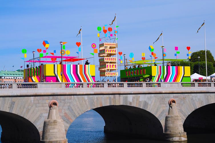
            One of the most important decisions in planning a large event is location. Many festivals look for large, grassy, open spaces to set up massive stages. This is pragmatic, allowing for set up and tear down without disrupting pedestrian life in the area. It’s also easy to fence off and enforce ticket sales and security checks at entry. Another style of festival takes a different approach, taking place within the city itself. SXSW in Austin is one such example, where instead of building special stages, every bar, coffee shop, patio, rooftop and backyard has a band playing for a full week. Kulturfest does neither of these, combining the two approaches in a way that deliberately subverts the norm. They still build their big stages, but in the middle of Stockholm (almost like a site specific piece reacting to the city). What do they gain from doing this? First of all, a central location makes the festival easy to get to for more people. Public transport can shuttle people in and out on normal routes. Second of all, the festival almost markets itself. The people living in the city will have watched the stages and festival backdrops being built in the weeks leading up to the festival, and tourists will be sure to pass through on their first sightseeing walk through the city. And finally, the disruption of normal life that occurs when an exciting obtrusion is dropped into the middle of a city creates a surreal atmosphere that encourages people to forget their daily stresses in favor of a weeklong party in the streets. Without ticket sales, there’s no need to police any sort of border and the edges of the festival meld seamlessly into the city itself.


As far as the actual entertainment, my knowledge is unfortunately limited, as all we were able to observe were musical acts. But the range displayed even in this one area was significant. They managed to represent both the local community with acts like the Swedish Radio Symphony Orchestra and to acknowledge the international nature of the city with acts like Ibibio SOUND MACHINE, an afro-disco-techno-postpunk group of Nigerian origin. Few of the names were of enough fame to be immediately recognizable, and what we saw were clearly intended to be cultural in a way one wouldn’t normally get to experience. In essence, rather than drawing crowds through big name groups, Kulturfest aims to create unique moments.
            The age spread was also specifically cultivated. At first the crowd at the concerts seemed abnormally old – we were probably the youngest by fifteen years at every performance. But this makes sense, it turns out, as Kulturfest has a DJ stage for 13-19 year olds, as well as events designed for kids under 13. By splitting events by generation they were able to more directly appeal to each bracket, instead of trying to broadly appeal to everyone at once. Parents and kids would be particularly invested in this, as it gives them an opportunity to go out into the city independently and in a safe environment.
            The visual aesthetic of the festival was less unorthodox than its location and musical choices, but it was still successful. The bright colors on the posters were simultaneously eye-catching and organized, corresponding to the colors of the stages (for example, all the acts for the 13-19 year old stage were scheduled in yellow). This was orienting for festival-goers but more of a practical decision than an artistic one. The only real visual art in the festival setup was a brightly colored archway marking a kind of entrance. I use the term "archway" loosely, since its full effect was to be walked under - see below. Unlike the posters, the arch served no mundane purpose. As I said above, there was no real beginning or end to the festival ground and the two main stages were actually on either side of it. It couldn’t mark the entrance to the festival then, so it’s purpose must be an artistic one. It stood as an attention-grabbing monument to center the festival and ground it in its physical space. And its impressive size and bold colors served to heighten the electric atmosphere.


            We often think of festivals as containing art in traditional forms – music, theater, film – but a festival itself can also be viewed as an artistic endeavor. The decisions that go into a festival of this kind are always deliberate and say quite a bit about the intentions of the organizers. A festival is about cultivating an atmosphere and creating an immersive and extended artistic space. A series of performances is not a festival, no matter how incredible they may be. But when framed in a successful way, with the audience as a top priority and many demographics in mind, thousands of people can have a unique and meaningful experience. 

Tuesday, August 18, 2015

United we Stand, Divided we Rot

I was going to write about the Moderna Museet. I took detailed notes and read up on the museum’s collection. I had even decided to make The Enigma of William Tell my focus. But then I went to the Vasa Museum, and everything changed.

As the daughter of over-educated parents, I spent at least 5/6ths of my young life inside of museums. Every gift I received between the ages of 0 and 14 was from a museum gift shop. This means two things: 1) I’m very spoiled 2) I have a lot of data points to which to compare new museums. So when I say that the Vasa Museum was incomparable, I say it in earnest. My expectations were high. As soon as we arrived in Stockholm, I texted my dad to let him know I was safe. His immediate reply read: “Promise me that you will go to the Vasa Museum.” So when I say that the museum was shockingly good, I really mean it.

The Vasa was a ship built in the late Renaissance at the order of King Gustavus Adolphus, the Lion of the North and the greatest warrior king that Sweden has ever had. The king ordered two gun decks—an unprecedented move for the Swedish fleet. As a result, the Vasa was taller and thinner than she needed to chart a steady course. She sank about thirty minutes in to its maiden voyage in the port of Stockholm on August 10th, 1628. This display was totally embarrassing to 17th century Swedes but totally beneficial to the rest of humanity because today, four hundred years later, you can go visit the Vasa in central Stockholm.

The Vasa Museum. Note that all four pictures here come from Wikipedia,
because I was too dumbstruck during my visit to document it properly.
All of my original photos are blurry and tear-stained. 

The fact that the Vasa survives as it does today is a result of an outrageously precise mixture of bizarre human folly and hyper-specific environmental factors. Most of those environmental factors were specific to the Baltic Sea. The brackish waters of the Baltic aren’t salty enough for teredo worms, which feast on sunken ships, to thrive. The silt in the bay is very low in oxygen, and the water is very cold (I've confirmed this), which provided the perfect environment for preserving the intricately carved wooden sculptures. 

The decorated sculptures on the Vasa model's stern.

Visiting the Vasa Museum is a little bit like visiting a cult. To see the exhibits and to interact with the museum staff is to experience, almost, a new way of life—a way of life that revolves around this ship. At every turn—between breaths, in concluding sentences, as an aside—you’re reminded that, “If not for ______ we wouldn’t have this ship.” After enough of this, I too started to feel like the whole world, including historical and environmental factors, were all oriented around getting this ship here today. The whole thing begins to take on a great deal of weight.

And therein lies the artistry. It’s not just that the ship itself is a work of art (though it is). Nor do I necessarily want to argue that all curated exhibits constitute art (though maybe they do). But this one does. In the same way that the ship serves as the focal point for all of the exhibits, physically and theoretically centering everything else, there’s a clear message that underlies and unifies every scrap of supplementary information provided.  Everything ties back to the uniqueness of the circumstances that led to the Vasa’s being here with us today.

The Vasa's Route.

A human exemplar of this was my tour guide, who excreted enthusiasm—but also a grave seriousness—from every pore. His sternness was paired with a head full of long black hairs, each taking off in a different direction. He told us we could ask him anything, and so I did.

Me: How much wider would the ship had to have been to sail stably?
He: About a meter. Just one meter more and we wouldn’t have the Vasa today.

Me: Wow, that’s a small difference. Surely they had little miniatures that they were floating in bathtubs to test these things out. Whence the enormous miscalculations.
He: This was not naval engineering, this was Swedish war propaganda. If it had been naval engineering, we wouldn’t have the Vasa today.

Me: Were all of these sculptures attached to the stern, or were several made from a single piece of solid Oak?
He: Each was made individually by a German craftsman and then attached with nails to the stern. The nails quickly came loose and the sculptures sunk beneath the silt, where they were preserved. If not for those loose nails, we wouldn’t have the Vasa preserved as she is today.

Me: How did the Swedes even know about lions in the early 1600s?
He: I have no idea, but if you ask me, it’s overused.

Except for the last example (which just amused me), all of the guide’s answers managed to cast even distant cosmic perturbances into supporting roles in the Vasa narrative. The plaques around the museum did the same thing constructing a destiny around the Vasa that felt totally inevitable. It was art. But where was the artist? Was it the guide? The documentarians? The curator?

The Vasa as seen from the 6th floor of the museum.

I think it was the Vasa herself, and I’ll tell you why. The Vasa was a uniting force long before this museum was built. On her stern, we see grotesques, sirens, tritons, and Norse Gods commingling. At the time, Norse Gods were tres not chic. They were for common people, which is why it’s all the more striking to find them on the stern of the Vasa, interwoven with renaissance figures, Roman soldiers, and symbols of the Swedish monarchy. This was truly triumphant war propaganda, not just in scale and lavishness, but in the scope of its inclusivity. This was a symbol of Swedish power that everyone—from the prince to the pauper—could feel a part of.

In that sense, the Vasa truly exemplary piece of art—she was created with a greater focus on beauty and emotional power than on military prowess or even structural stability. The Vasa is clearly not just a ship. Ships trade on floating—sailing, even. The Vasa was a symbol of Swedish power. She could instill pride when she wanted and fear when she needed to. This was art created to unite classes, ideologies, and ultimately nations, under a single ruler. And the Vasa succeeds in that purpose—even after spending 333 years under water.


Friday, August 14, 2015

Israel Square: Shining, Shimmering, Splendid

            You may have heard the fable of the magic carpet, a rug capable of controlled flight. The legend has a rich history beyond Disney, one of thieves and madmen and kings and war. In each story, the magic carpet allows the rider instantaneous passage and escape, as well as a lofty perspective to either destroy enemies or take your love interest on a musically charged first date.
            The magic carpet story is one that has changed throughout history, but has had much less of a contemporary presence—until now. Situated between Ørsted Park and Torvehallerne in Copenhagen lies a real live magic carpet. It’s more than 12,000 square meters and is accessible to anyone who can find it.  All you have to do is ask for Israel Square.
            The square was once part of the defensive shell of Copenhagen, used to defend the city from attacks. Built upon the ramparts in the mid 1800s, the park was utilized mostly for dog walking until 1968 when it was adjoined with a vegetable market. The space was then dubbed Israel Square as a memorial for the Jewish citizens persecuted by the Nazis, but served mostly as a car park.
            Now, Israel Square is a large public plaza newly renovated by the architects at COBE. The square resembles a large magic carpet, with complex folds that give what was once a concrete lot beauteous topography. The area is slightly raised, establishing it as a separate entity from the surrounding neighborhood and requiring pedestrians to step up onto it. At night, LED lights line the edges of this platform, creating the illusion that the square is hovering above the ground.
            The magic carpet is a delightful motif, yet it is the design principles that are utilized to create this idea that make Israel Square such a successful public space.  These principles have to do with the careful usage of vertical space and discrete lines. Although the space is made of mostly concrete, it has an unusually earthy feel due to the constantly changing topography. Opposite corners of the park fold up into wing-like sitting structures; there is an organic, bumpy decline to the slightly sunken basketball court; the smooth shallow bowl of the mini skate park; even the trees are on raised surfaces and the lamps of the streetlights at different heights. These components are more than mere wrinkles in the magic carpet—they keep the space interesting and promote exploration. They also serve as a great transition from the smooth city streets to the hilly nature of the adjacent park.
            This transition is also supported by the use of discrete lines. Whether it is the grid pattern on the ground, the radial lines of the wood paneled benches, or the vertical bars of the basketball area, winged corners, and trees, the pedestrian gaze is guided in a multitude of directions. This makes the space feel more inclusive, incorporating the surrounding neighborhood and beautiful structures around it.  It also allows the space to be very open whilst maintaining its complexity and gives each component equal attention, keeping any one part of the space from being the main attraction.

            If there were to be a main source of wonder and gaze, I would hope that it would be in relation to the square’s history-based moniker. Upon learning about Israel Square, I was surprised at the lack of memorial to such a complex and horrific historical massacre of people. There is a statue at the entrance of the square: a large rock inscribed with Hebrew. Perhaps this is enough for some, but I felt a bit disappointed in this effort and began to search for additional tribute to the Jewish lives lost in World War I.  This may be a misinterpretation on my part, but I found the use of vertical metal bars and the center basketball court’s cage-like construct an interestingly dark aesthetic and possibly purposeful commemorative design choice.  This is a strange juxtaposition with the playful atmosphere that is much more opaque and infectious than the darker one that I was seeking out. The soft material surrounding the courts, the skate park, the small playground, and the various leap stones are begging to be explored and played with. Despite the minor memorial issue, Israel Square is really a magic carpet ride, intriguing the passerby to join on an adventure and safely delivering pedestrians from the city to the park in a magical transition.